A Wes Anderson Vignette
A film is—or should be—more like music than like fiction.
-Wes Anderson
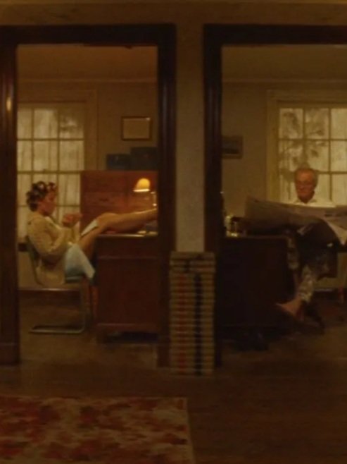
Charming, twee, whimsical, nostalgic. These are just a few words used to describe Wes Anderson’s trademark film style, called formalism, which uses quick camera shots, wide angles, a pastel color palette, and instrumental background music to convey a highly-curated narrative. Anderson, a true film aesthete, has forged his career by creating his own cinematic universe, with familiar, quirky characters, keen attention to detail, and dreamlike storytelling.
When trying to emulate Wes Anderson's style, one is tempted to go straight to symmetrical framing and leave it at that. However, while Anderson does tend to keep the subjects of his frame centered (or entirely right or left justified), upon further inspection you will find that there is much more that goes into Anderson's unique mise en scène.
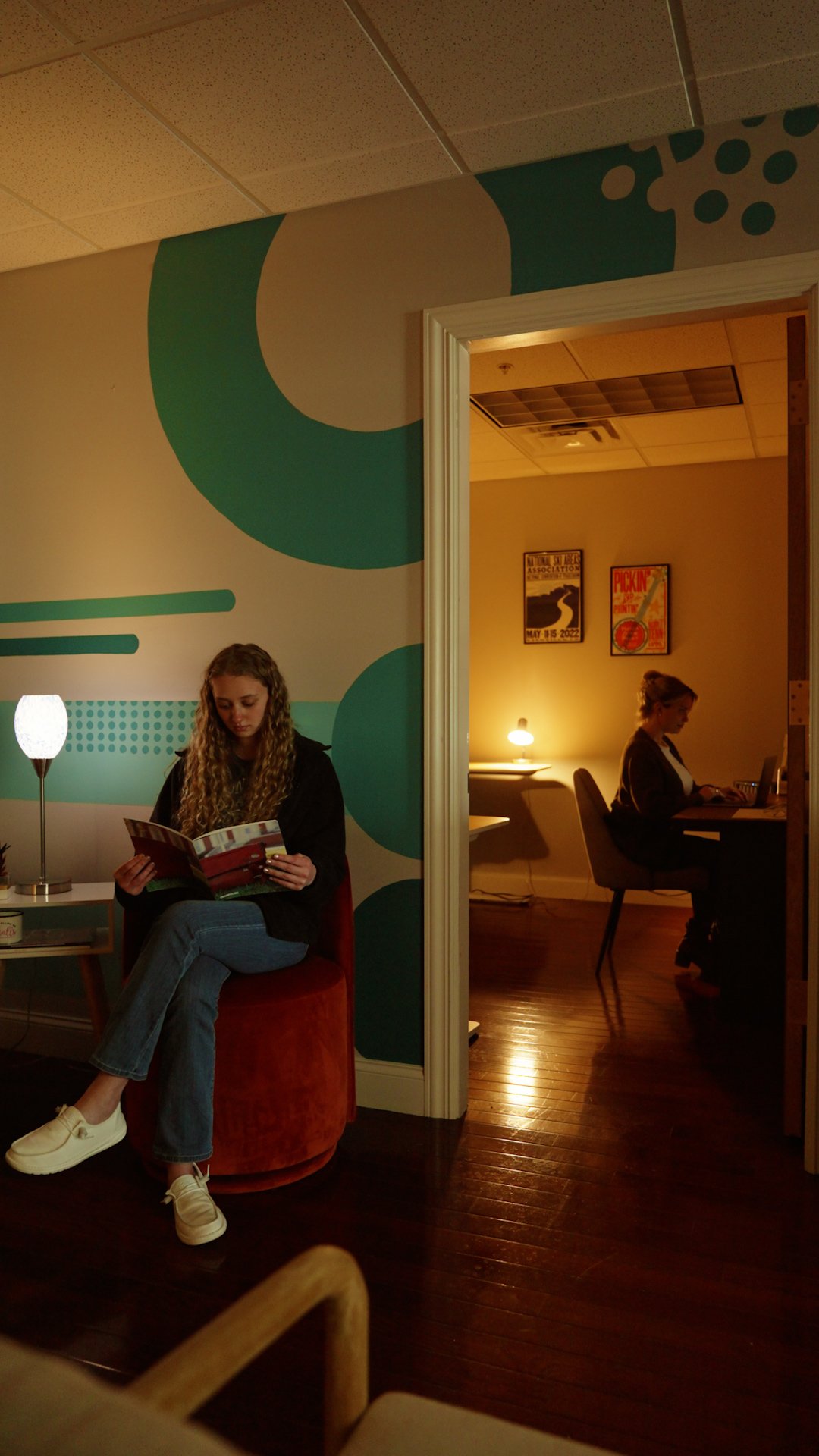
A recent trend on TikTok sees content creators imitating the director’s unique style, turning everyday occurrences into styled vignettes. Our Trampoline video team was keen to join the trend, turning our studio and hometown of Glens Falls into a scene out of The French Dispatch (music included).
Look Closer
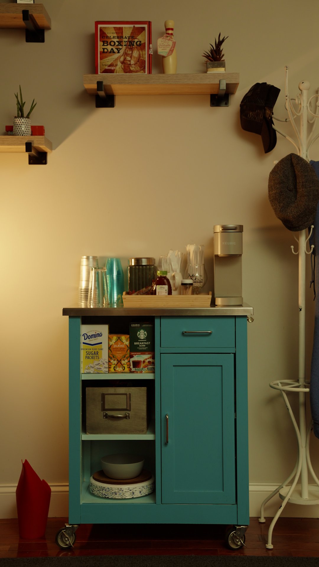
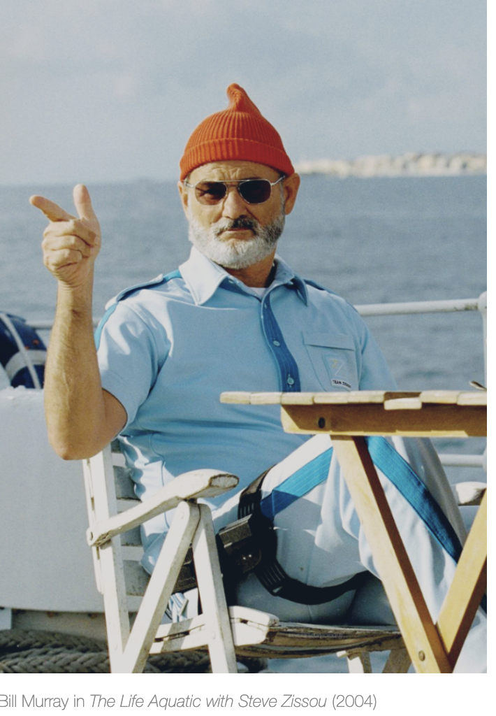
Anderson tends to be a lover of warm colors and a mid-century aesthetic. This led to a decision to push warmth into our images where possible. Anderson's frames lean into warmth in general, but to maintain a contrast in color he does mix in pops of blues and greens, along with even more striking pops of red (think Steve Zissou's uniform). Since the recently completed murals in Trampoline's office boast cool blues and greens, this gave us an opportunity to splash warm light onto surfaces while placing props, like a bright red watering can, into otherwise overwhelmingly cold sections of the frame. This also helps to nail down Anderson's cluttered worlds; rooms teeming with life where we would easily get lost, but the characters who inhabit them know exactly where everything is.
Anderson is also a fan of the reveal. Often this takes shape as a simple camera movement, taking the audience around a corner in an exaggerated dolly shot, or a snap zoom from an establishing shot to a medium close-up of a character who has seen some sh*t. We tried to capture this aspect of his style in the opening shot of the exterior of our office building and the pan from the corner of the main room to the smaller office.
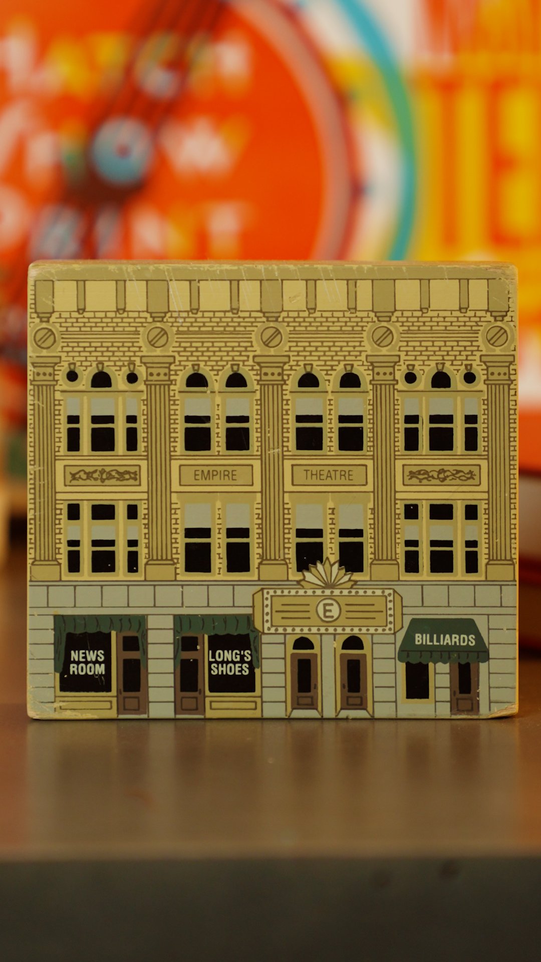
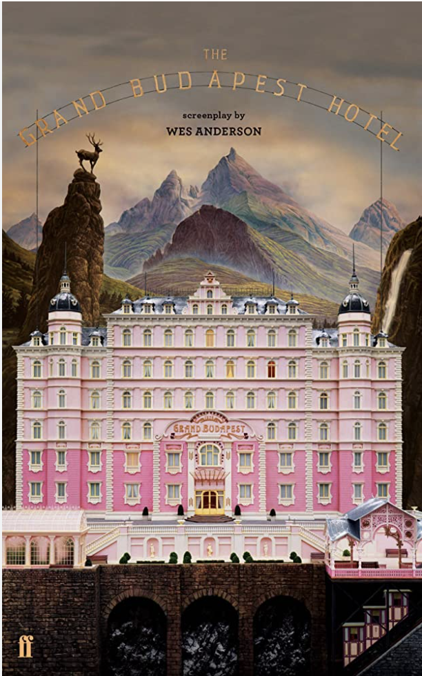
If you look closely, Anderson also tends to warp perspective. It is sometimes extremely subtle, like in the still above of the French Dispatch building. If you study the image, you'll notice that the building is dead on with the camera from the ground all the way to the top of the sign. This isn't how it would look realistically; it should appear to get narrower as it reaches into the sky. To achieve this look, Anderson employs combinations of real-life locations and miniatures. While we don't have access to highly accurate miniatures of our building, we do just so happen to have a small rendering of it that we used in the opening shot, as an homage to Anderson's use of miniatures.
 .sqs-block-summary-v2 {
.summary-title-link,
.summary-heading {
font-family: archivo black;
font-weight: 400;
font-size: 2rem !important;
color: ffffff;
} }

