
Cracking the Code on Breweries
Helping Breweries Refine Their Brand and Connect to Their Audiences.
PARADOX
The previous Paradox mark and message were often confused with other brewers in the region, and their draft and package sales were impacted—leaving them with a need to stand out on crowded shelves in an entirely new way.
As the brewery geared up to celebrate its 10th anniversary, the team wanted a new look to welcome the next chapter. The goal was to part with the ADK aesthetic and introduce a more universal look for national distribution and beyond.
A nod to the mountains and the history of place, but with a modern spin, Paradox's new brand upholds its roots and preps it for new adventures, forging ahead with a bold new look sure to win over even the toughest internet critics.

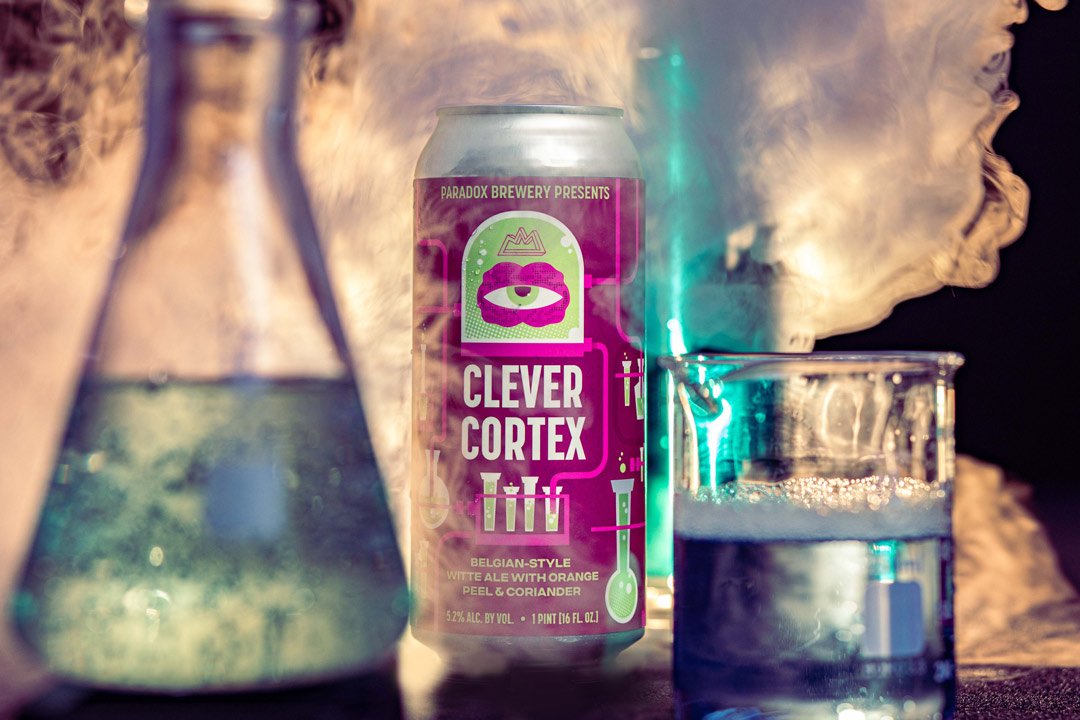


A complete rebrand, packaging update, and launch materials like photos and video have repositioned Paradox to appeal to a younger demographic. This has translated to improved sales, almost immediately, with Paradox Pilsner becoming the #1 selling Pilsner in New York*, despite not being distributed downstate, or west of Syracuse. Not to mention, 10th Anniversary merchandise sales during their celebration event topped $10,000 in a single day.
MEAN MAX
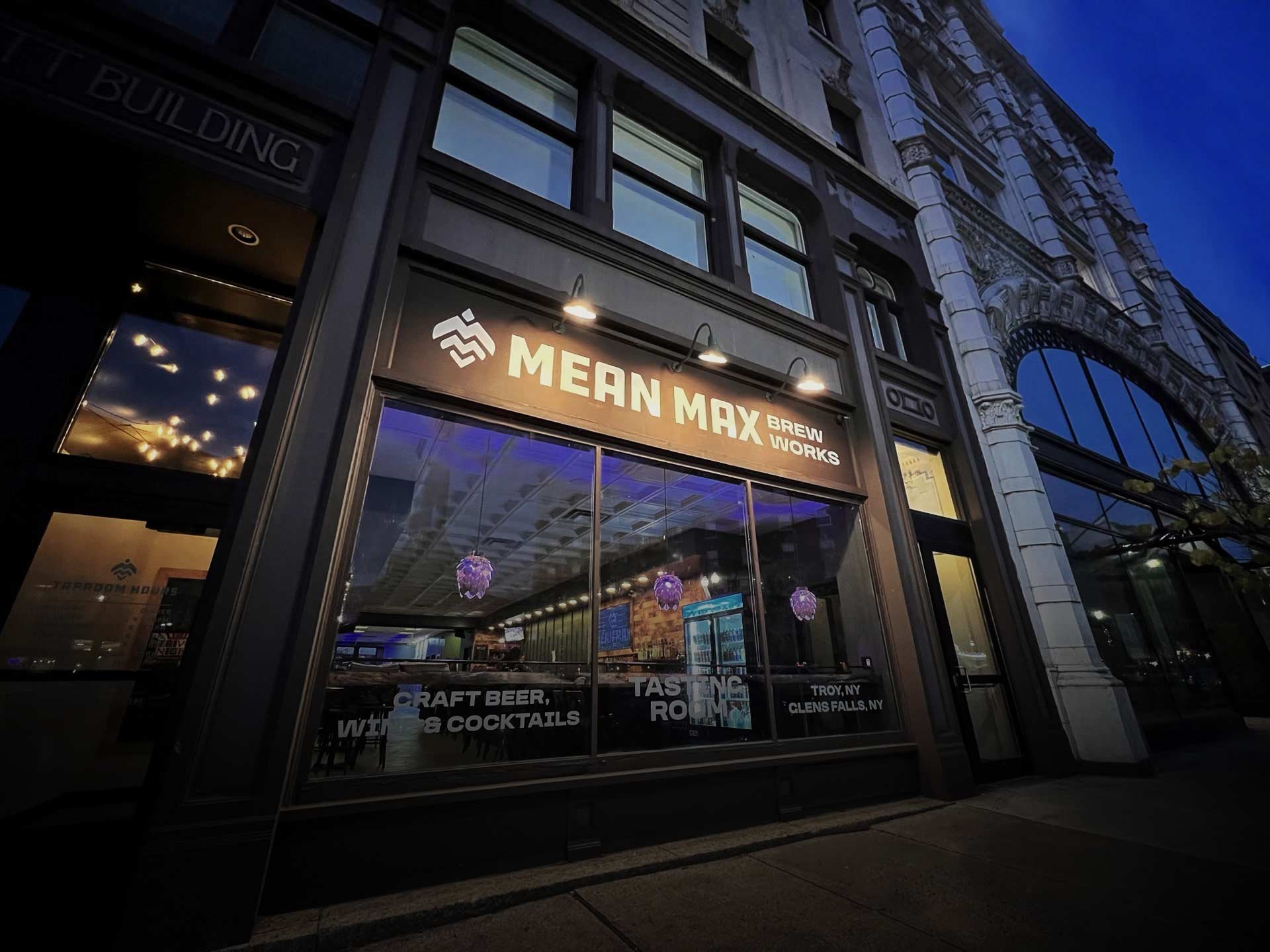
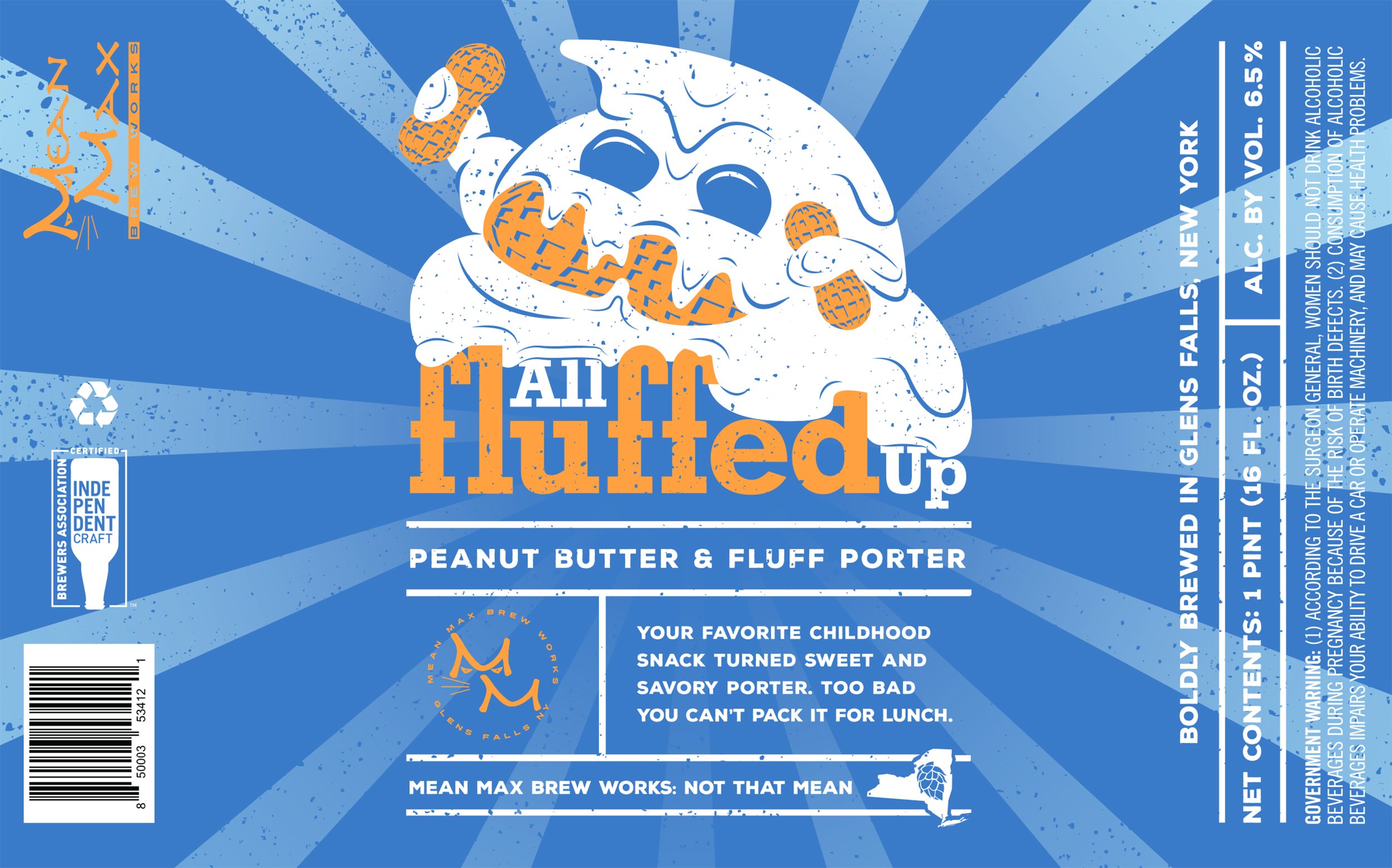
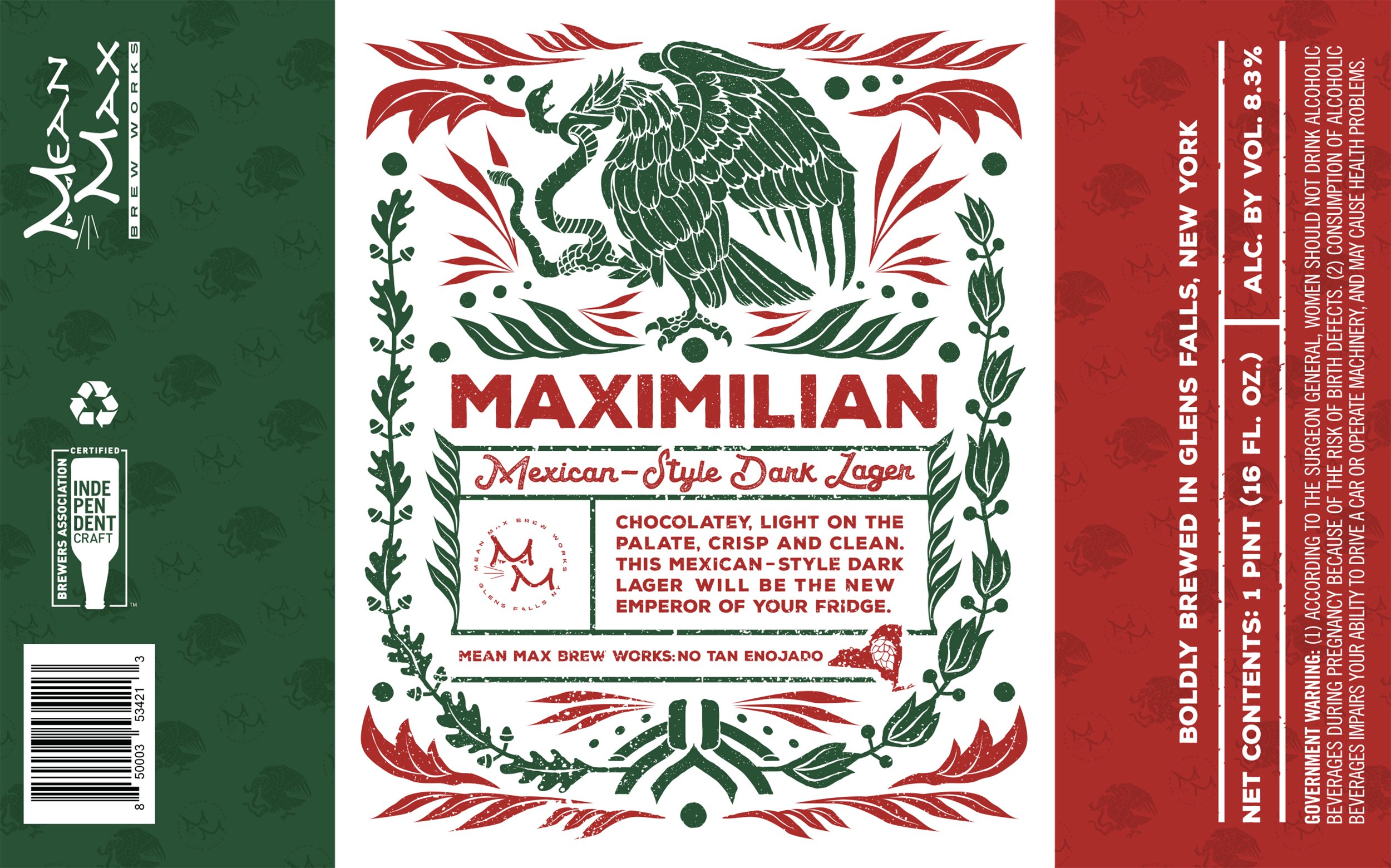
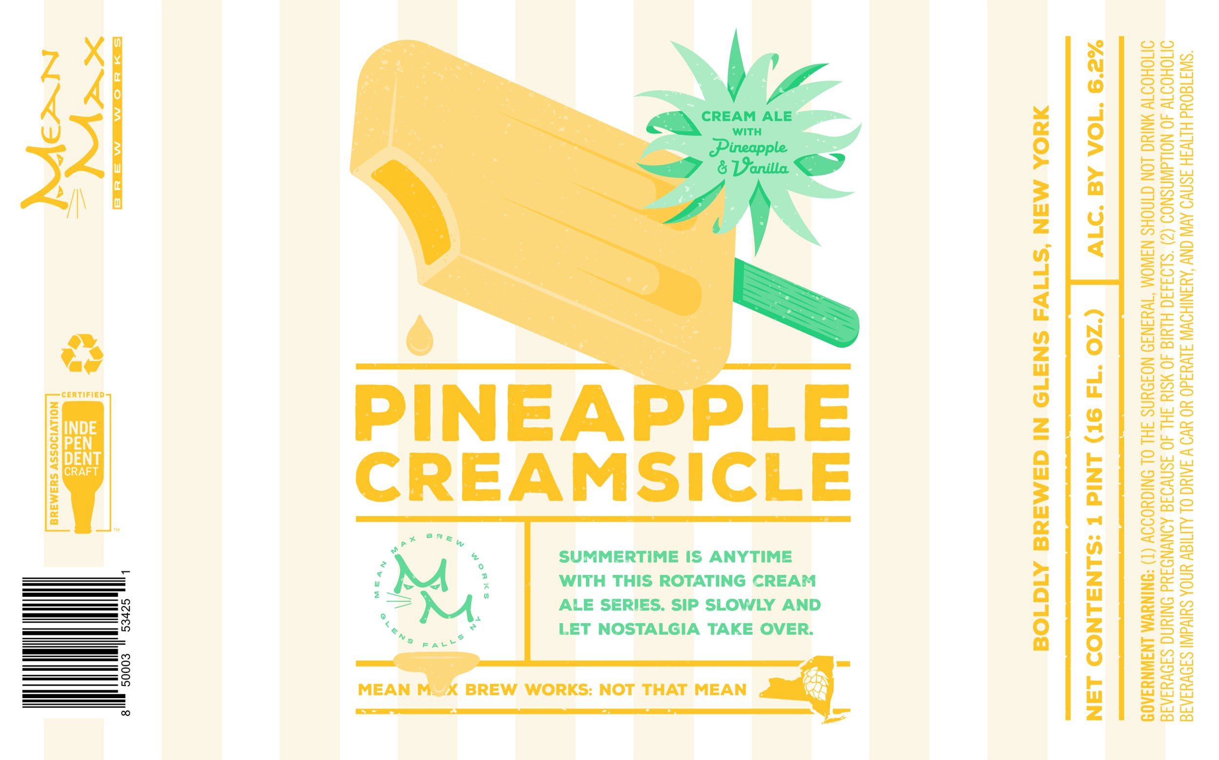
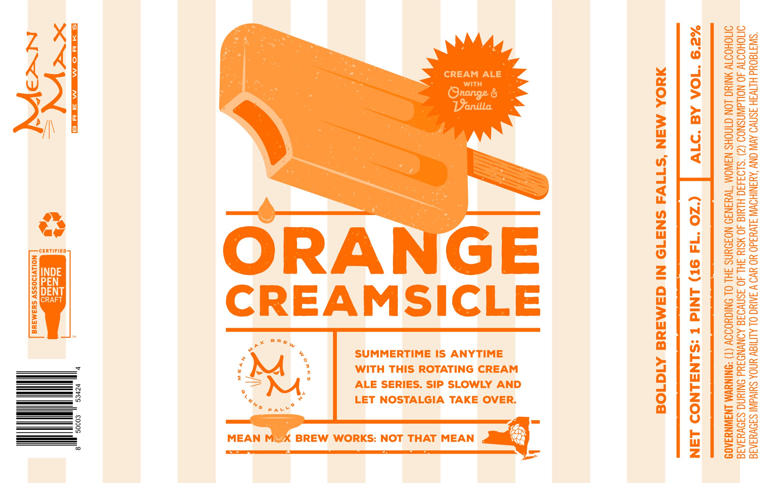
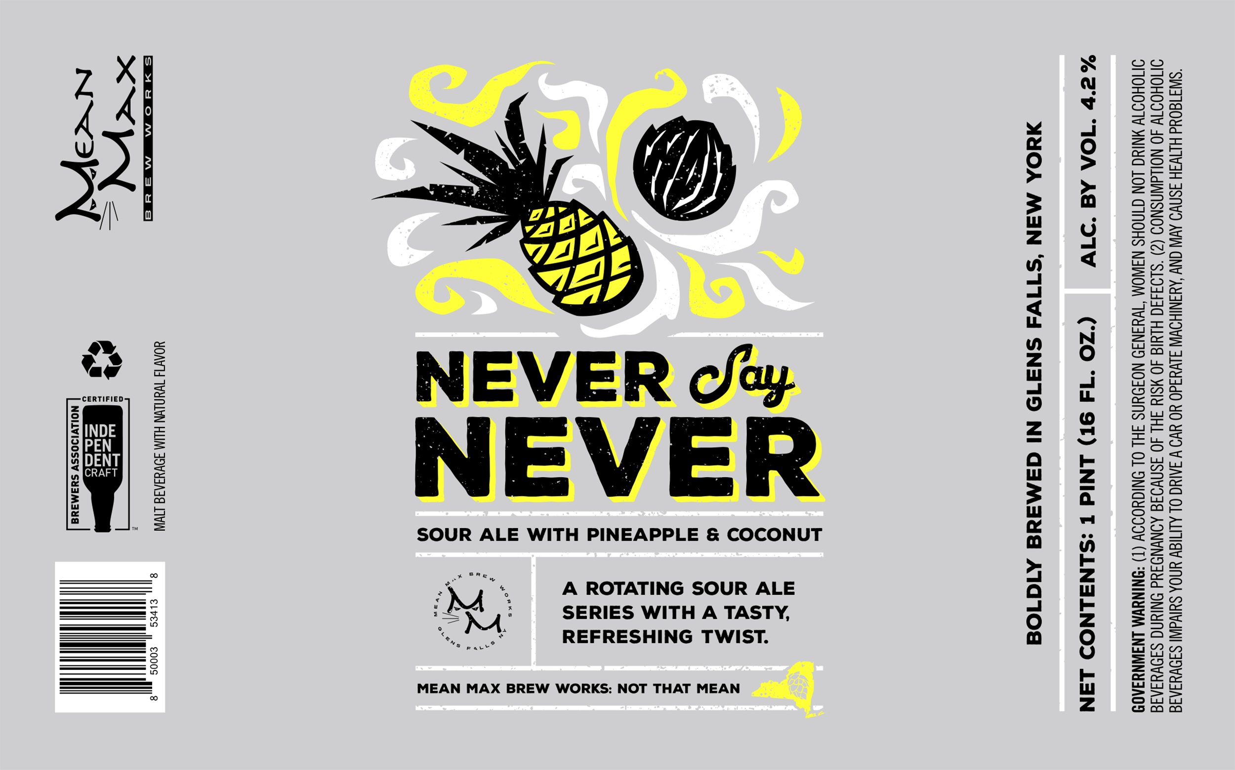
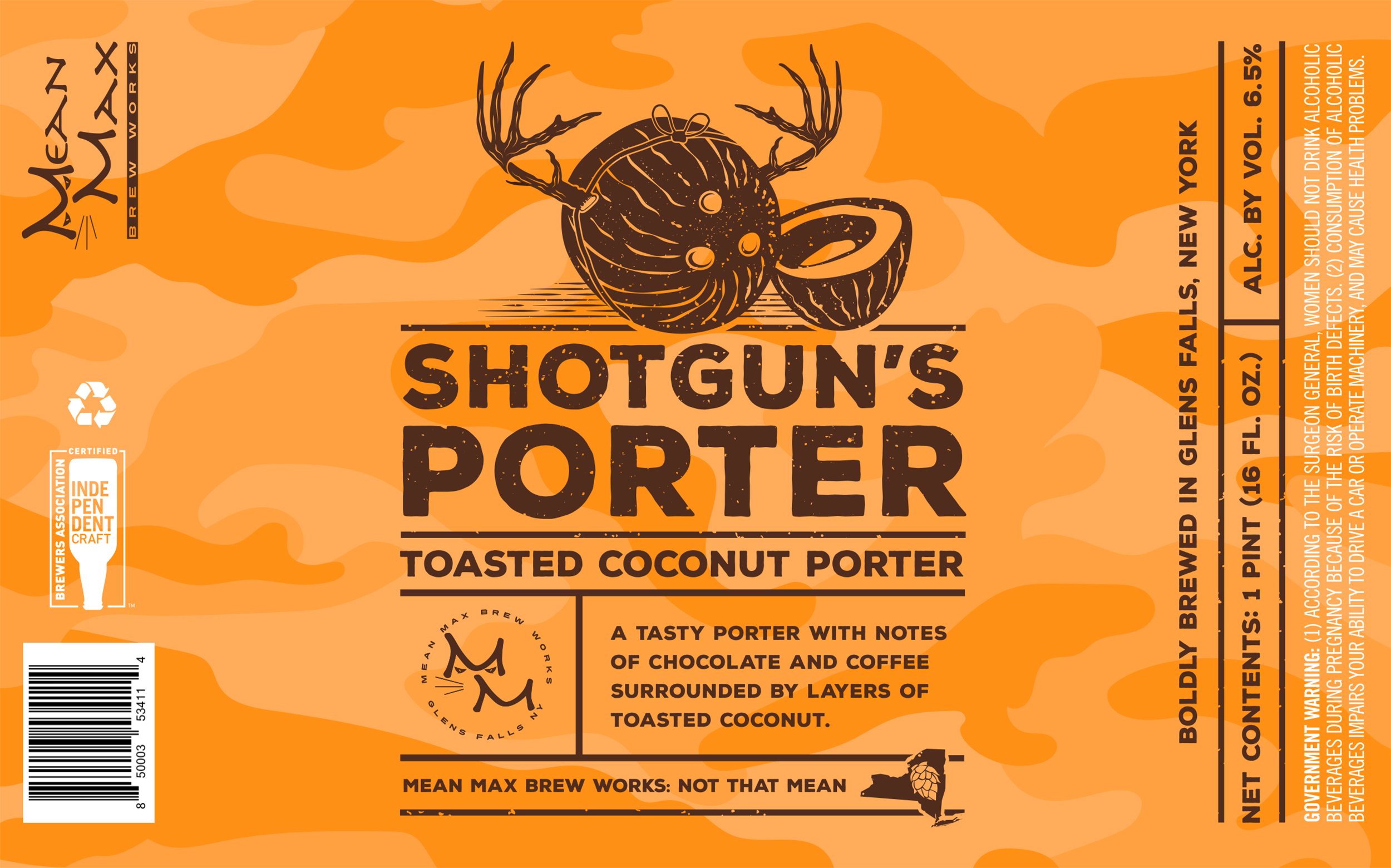
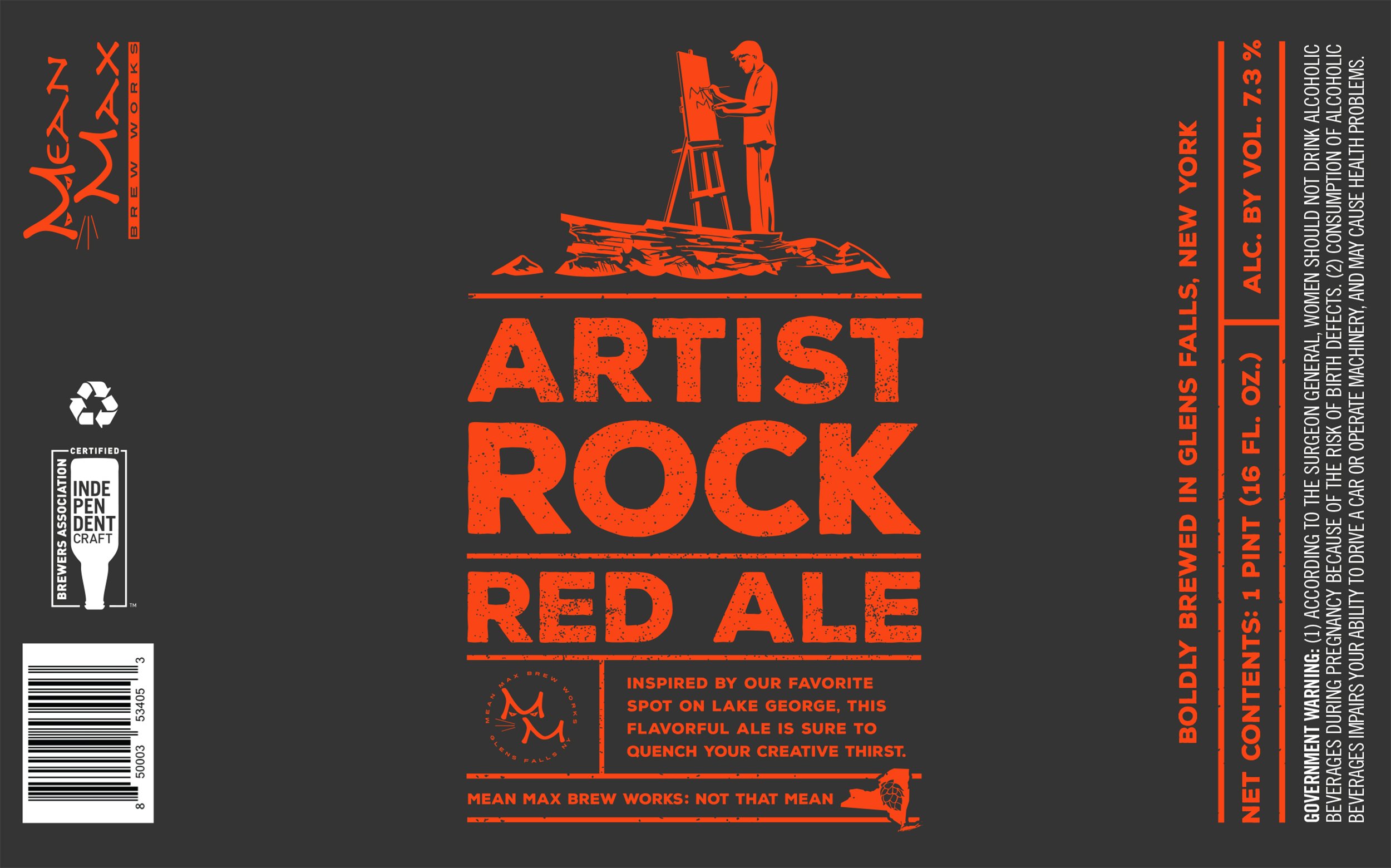
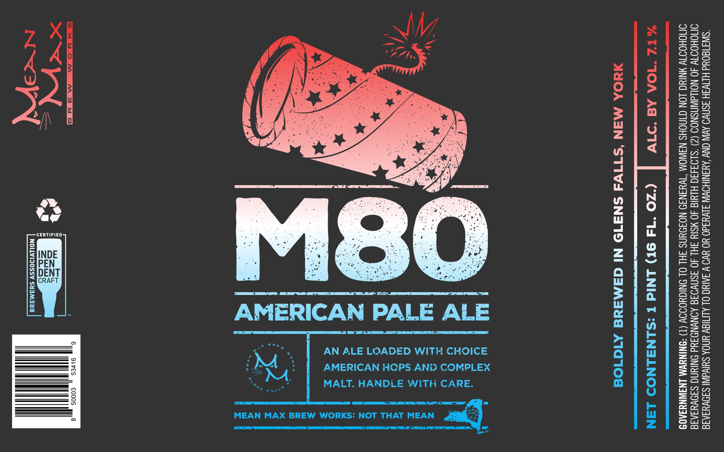
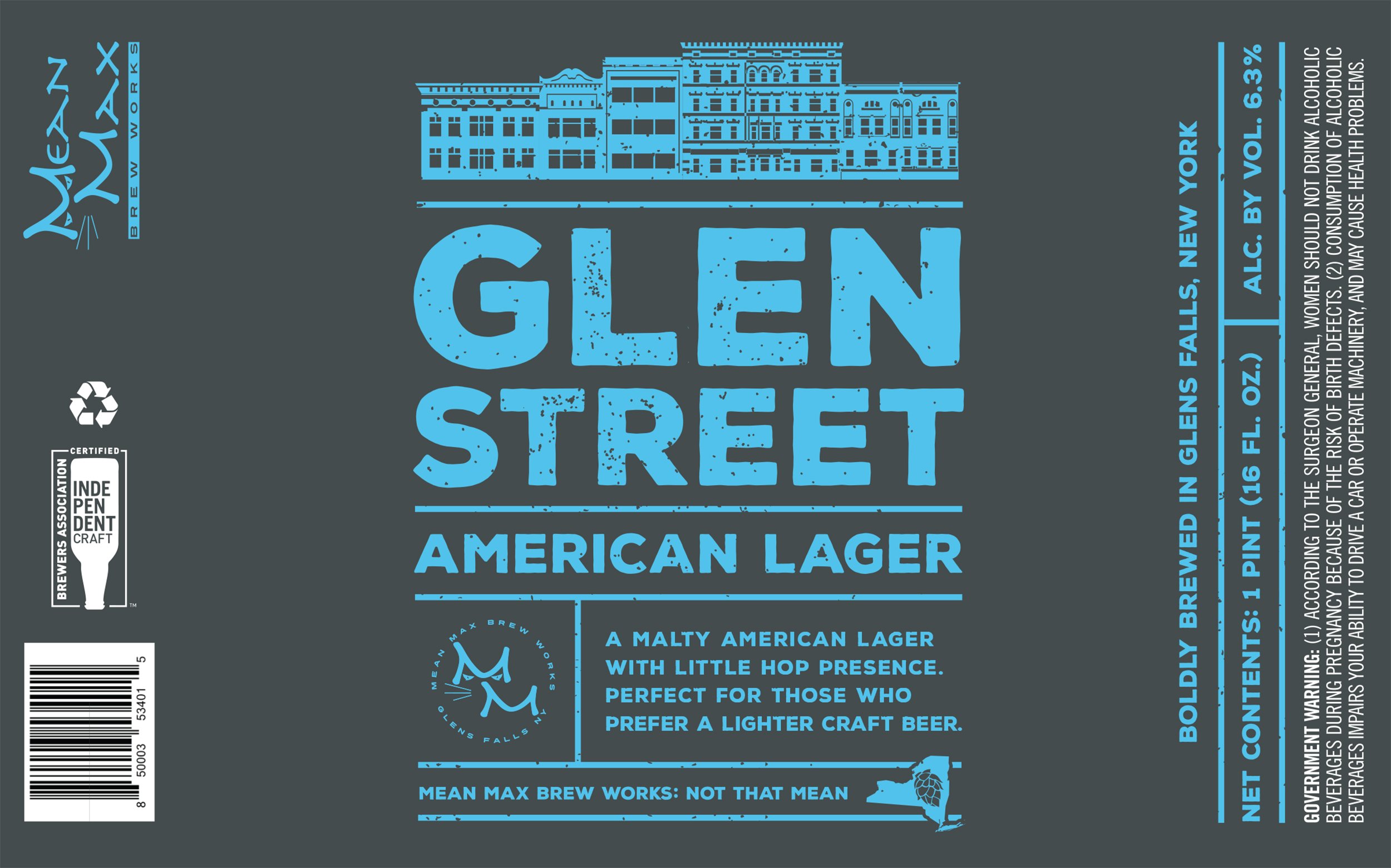
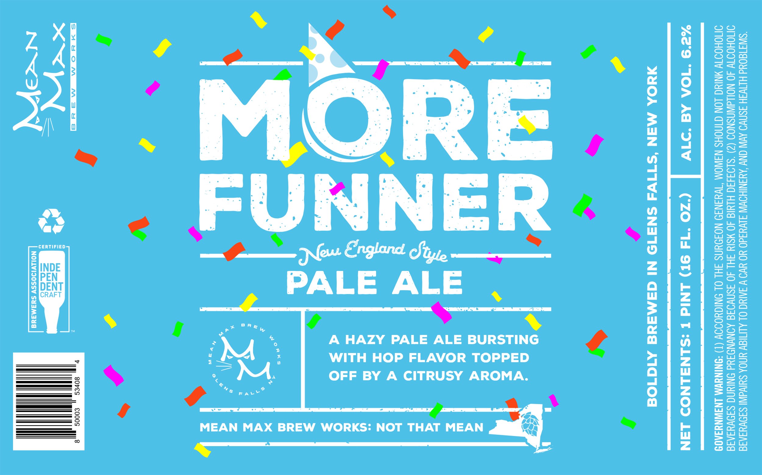
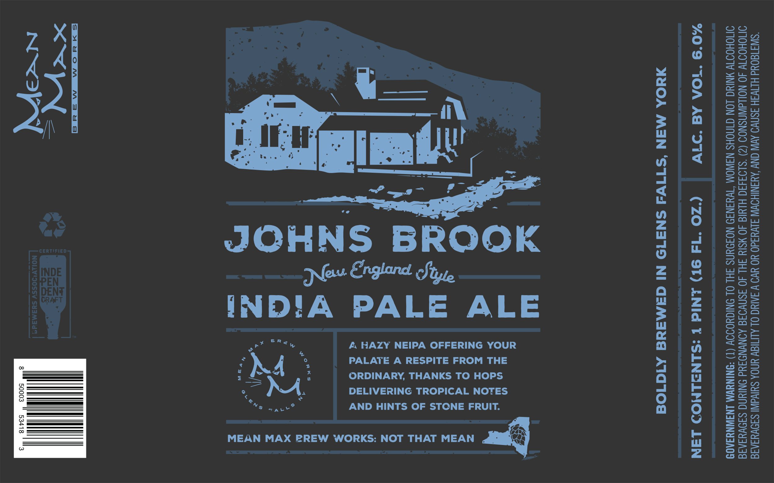
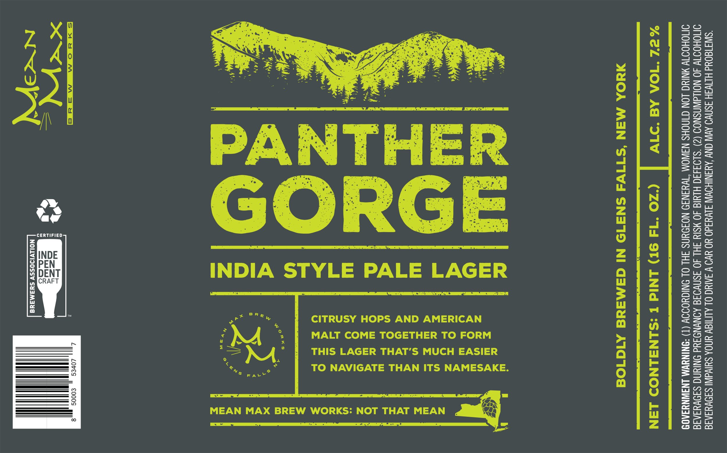
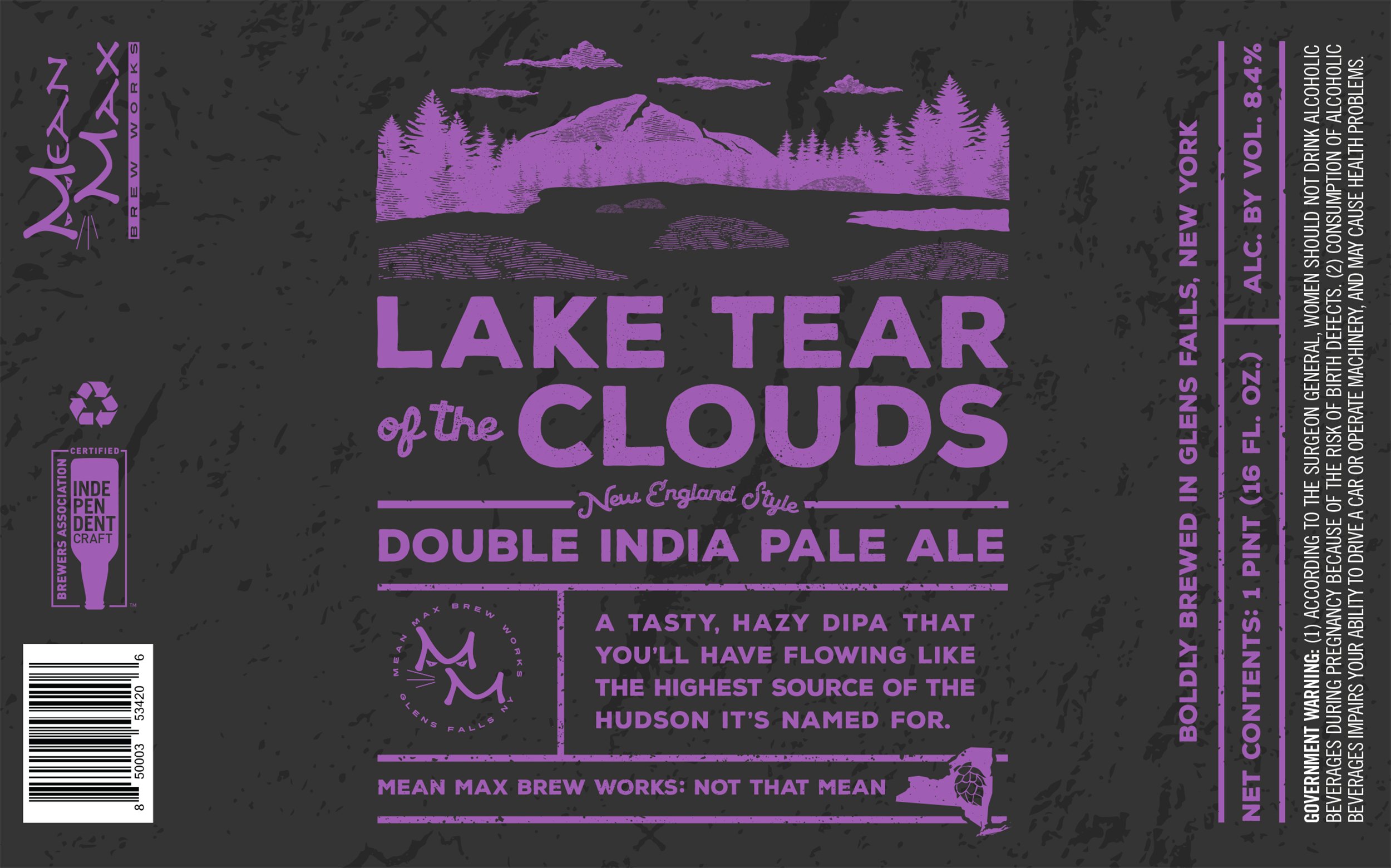
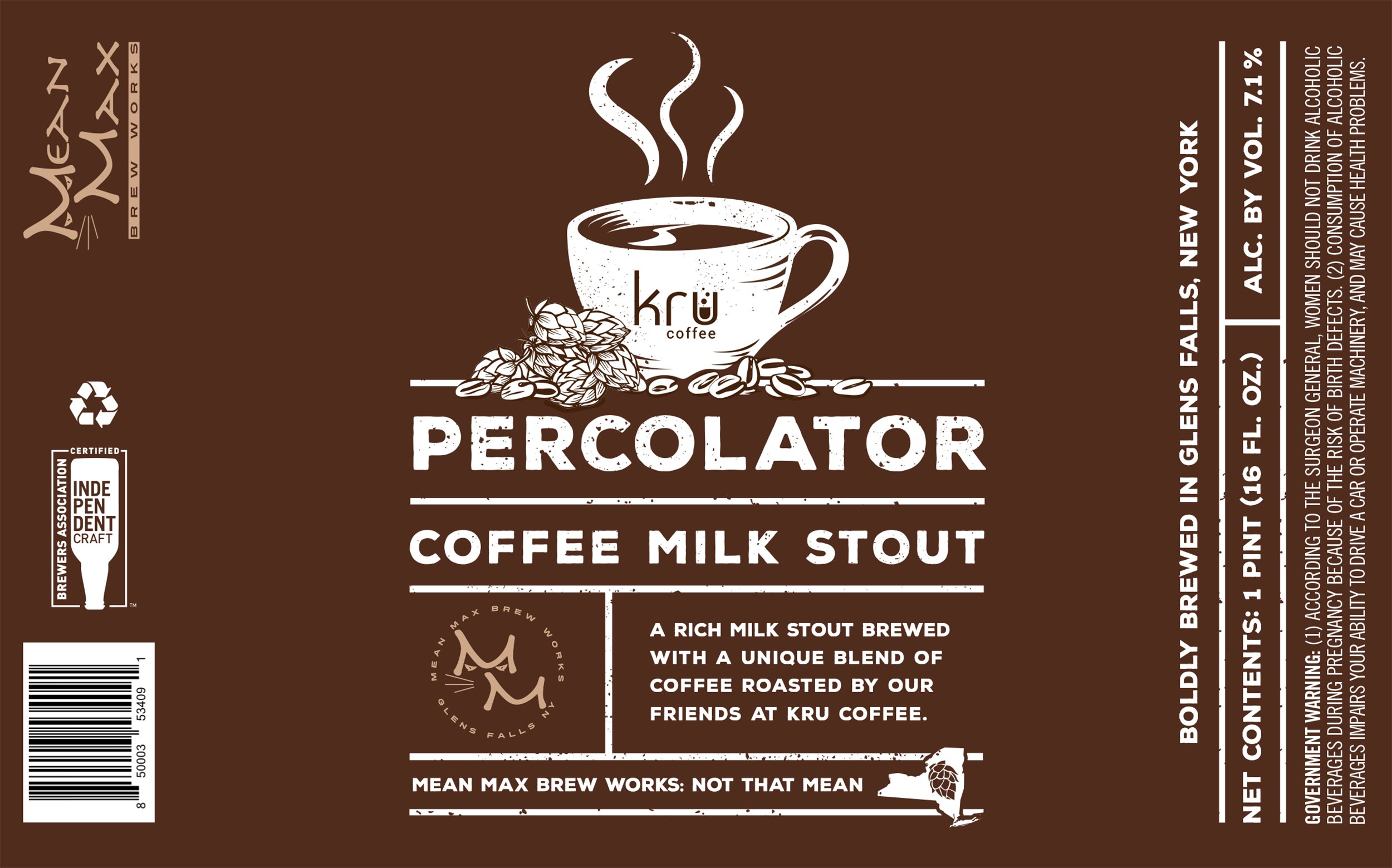
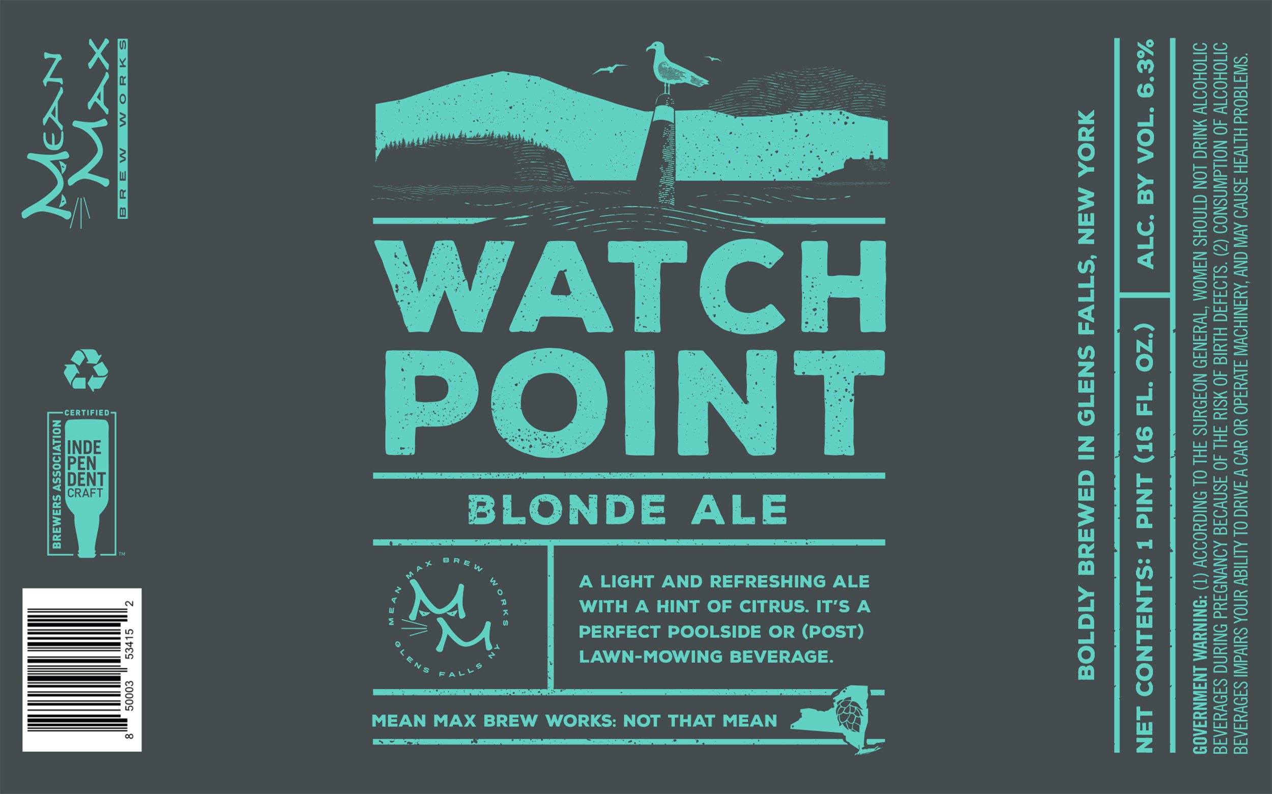
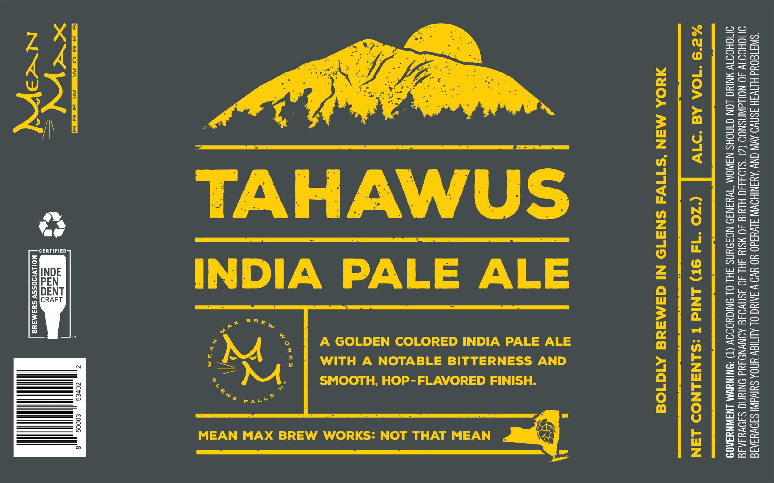
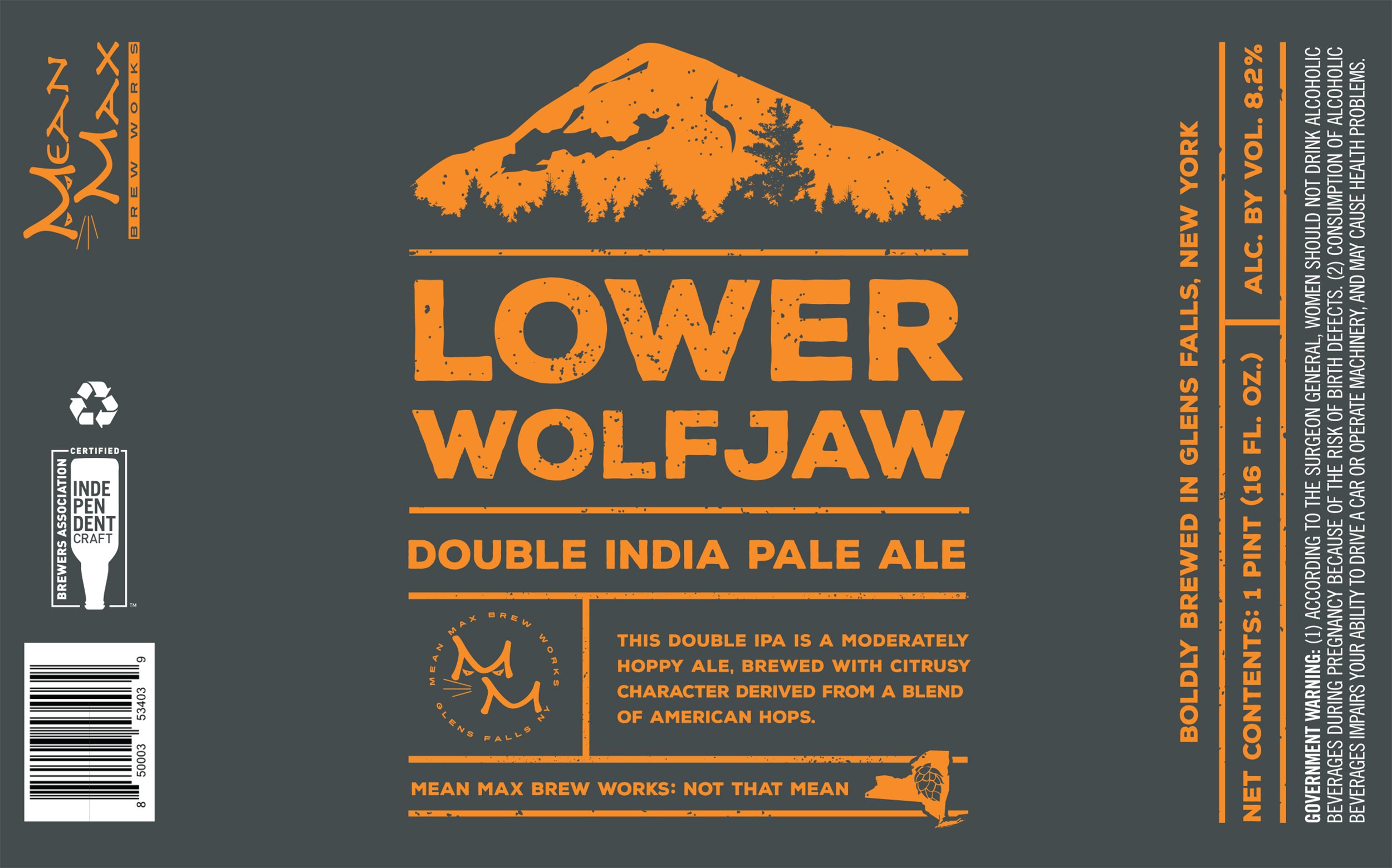
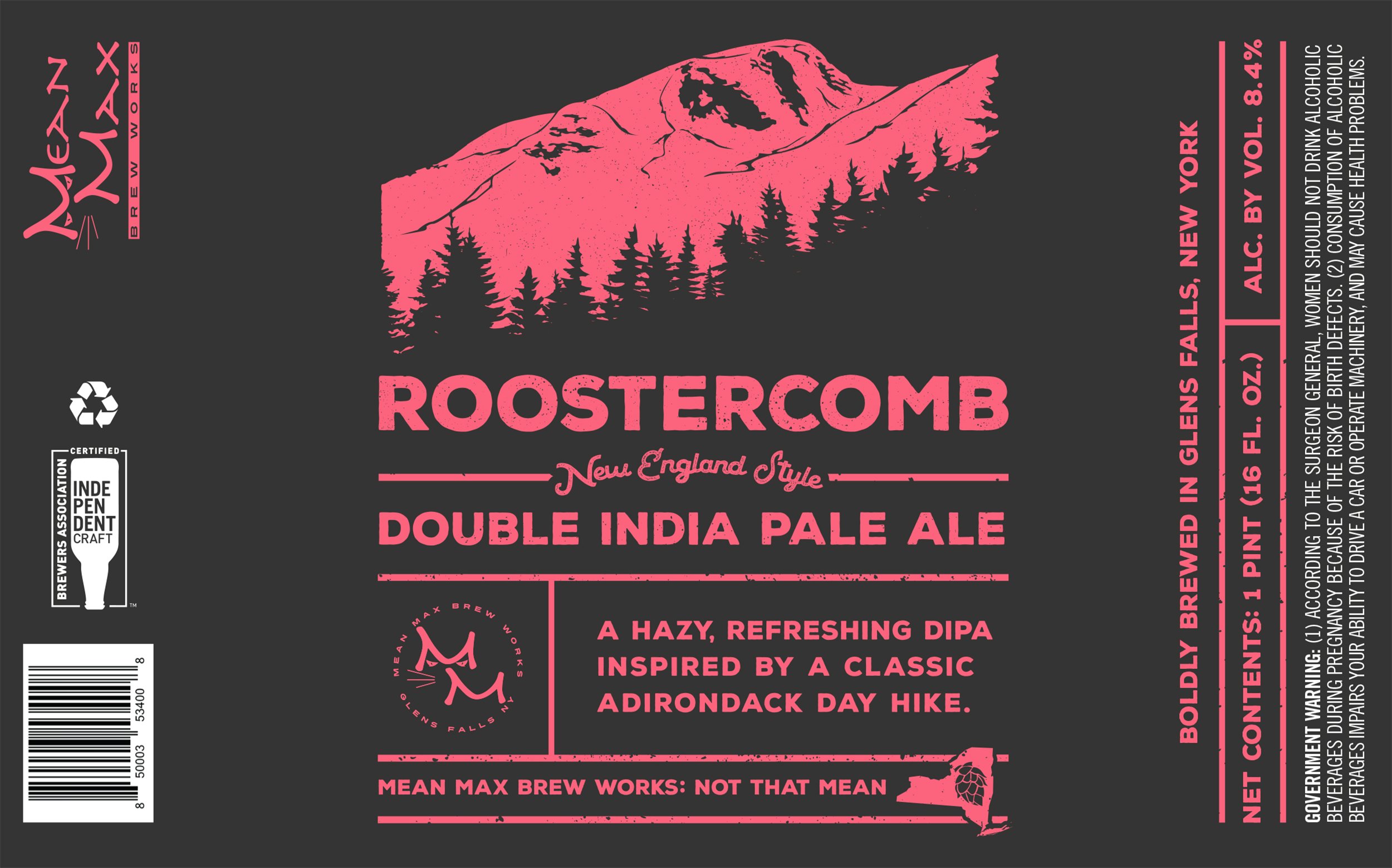
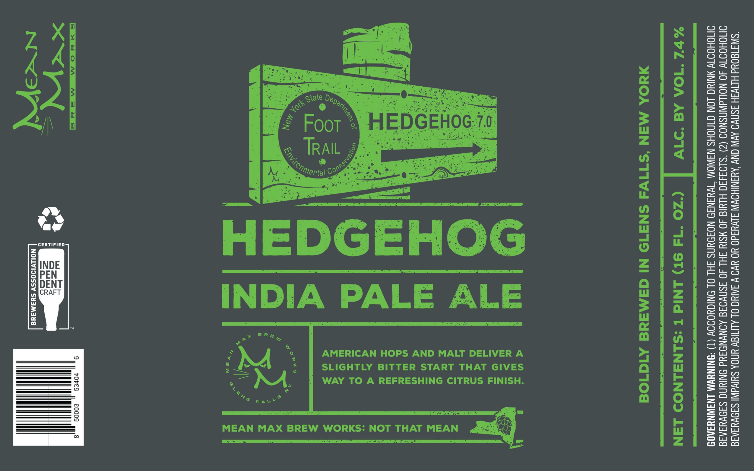
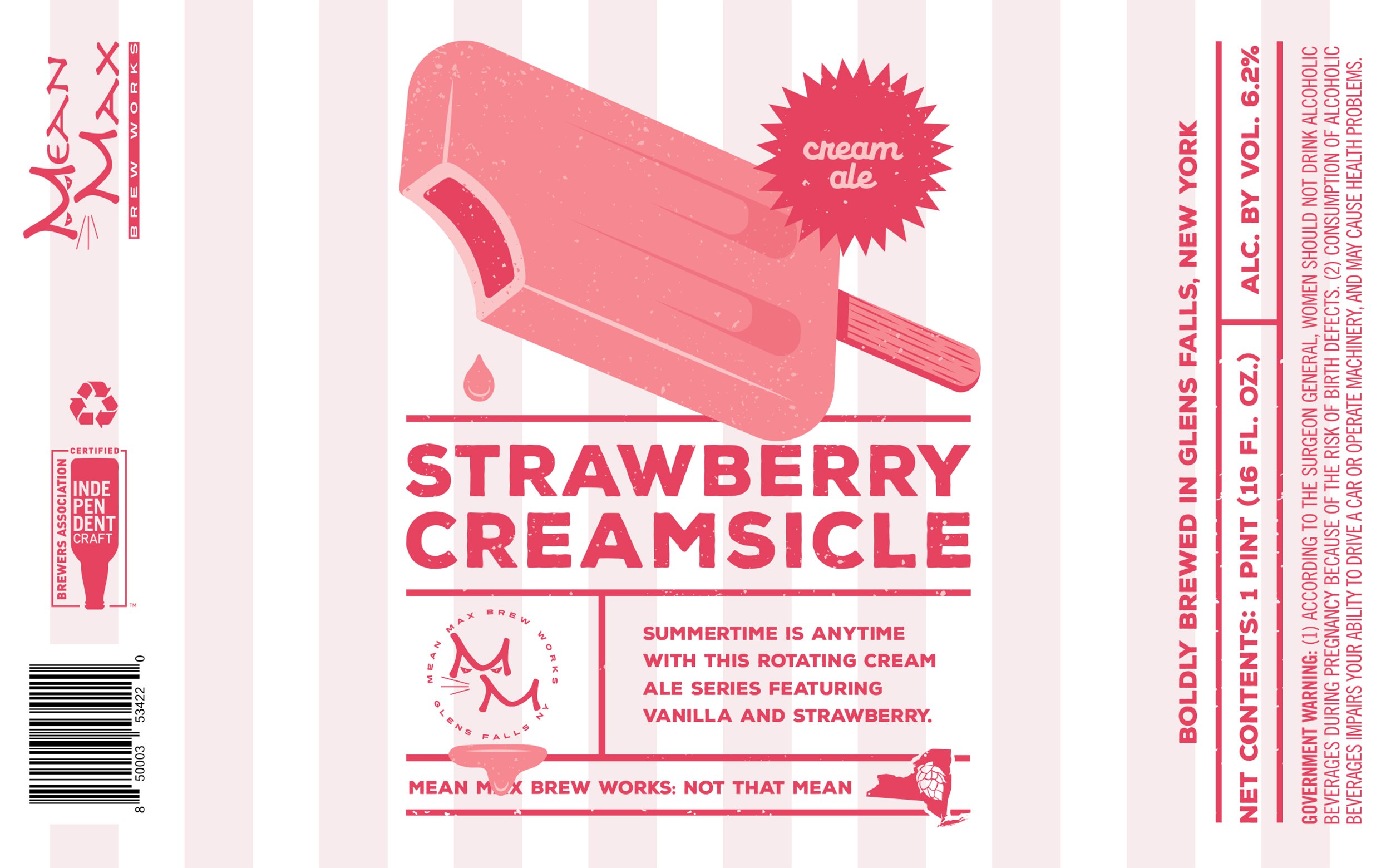
Mean Max came to us looking to update their brand on the heels of their Troy location opening. They wanted something modern, more industrial, and a bit more emblematic of their services—where the old logo didn't speak directly to beer. Our final mark utilizes an "MM" nested inside of a hop cone shape as well as an industrial typeface that speaks to the mill towns that both of their locations are in.
“We owe a debt of gratitude to Trampoline and its amazing team! You guys rock.”
-— Dave Walls, CEO/President”
DACKER
Dacker Adirondack Ale was a standalone product for Davidson Bros. Brewing Company, who took the Upstate New York craft brew scene by storm in the early 2000s.
This brand, heavily informed by the Adirondack mystique, featured the story of Duncan Kincaid, a lumberjack who traveled by float plane deep into the High Peaks on adventures that inevitably made him thirsty. The tagline “Knock Back a Dacker!” can still be seen on T-shirts throughout the Park.
RYLEY’S
This seasonal offering from Davidson Bros. was light and refreshing—and the brand was inspired by a classic lakeside summer Upstate. “Live the Life,” or so the tagline says.
Ryley took on a life of its own, jumping off store shelves and getting crushed on docks throughout the ‘Dacks. Cheers to summer!
BIG SLIDE BREWERY
& PUBLIC HOUSE
The Lake Placid Pub & Brewery needed a test-kitchen for experimental eats and new ale flavors. They created Big Slide to be just that: an introduction to the Lake Placid craft brew scene. On your way up RT. 73 you’ll find it—in the shadow of the Olympic Ski Jumping Complex.
This flexible logo design gave Big Slide different elements to use on packaging, merch, and in the space itself. The jump to a second facility has been successful, as the Ericsons will soon open RiverTrail Beerworks in Saranac Lake.
DRUTHERS
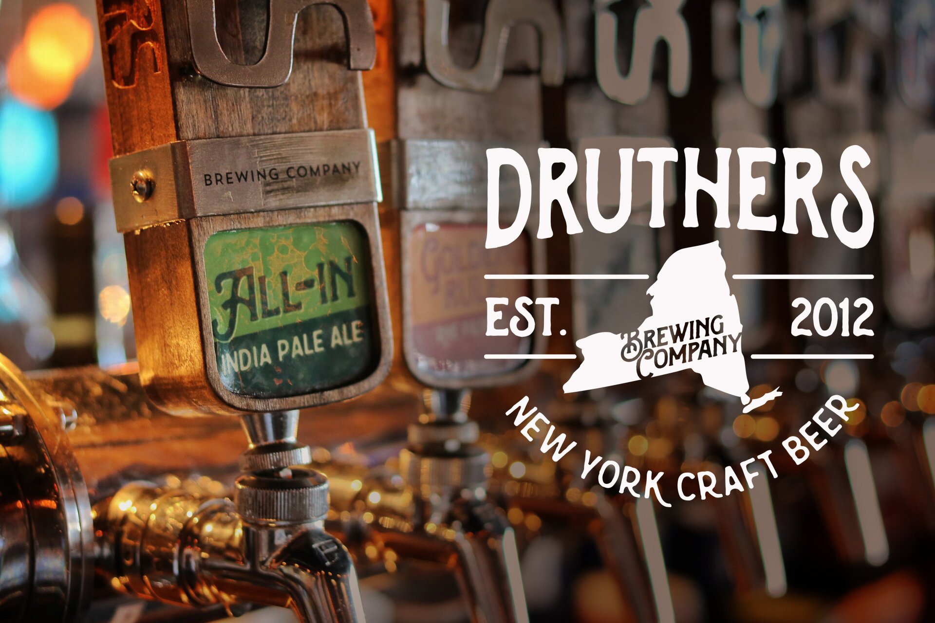
Our work with the Druthers brand took place at the height of their formidable rise to a multiple-location destination. Built on a love of family and fellowship, the Martell brothers have created a brewing behemoth. Our work with packaging, illustration, sales collateral, and on-premise messaging helped to launch the Albany and Schenectady brewpubs.
Whether you’re sipping on the Saratoga Lake waterfront, dining overlooking the Mohawk River, ordering a beer on Broadway in Saratoga, out for lunch in Albany, or taking a break in Clifton Park—it’s tough to miss a Druthers.


