The New H Word
As a person in the marketing and advertising industry, and just a general lover of good entertainment, my tv is something I hold fairly dear. Every once in a while though, I hear the media repeatedly posing questions about what America is or isn’t ready for and I think about hucking my tv into the Hudson. Hillary Clinton seems to bring out the, “Let’s make Kate rage at the tv” for the media.Hillary Clinton is a woman. Of interest is the way she's being treated by the media for being such, in the wake of her announcement to run in the next presidential election.
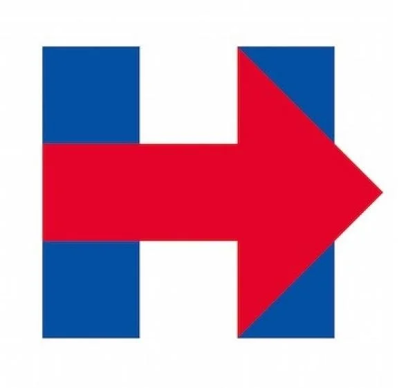
The media has made a distinct and conscious decision to only refer to Hillary Clinton by her first name, while still referring to the male candidates by their last name. This should be more newsworthy in and of itself, except that we live in a society where sexism isn’t the subject of news stories so much as something perpetuated by them. Did they really think she’d let that slide?In a strategic marketing move, Hillary’s team has decided to use the media’s sexist habit to their advantage. Hillary’s 2016 campaign -and more specifically, her logo- all revolve around the letter H.
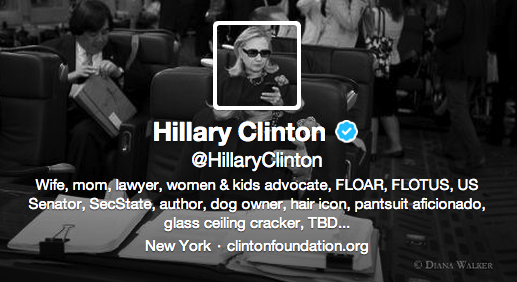
Did we really think a woman who’s been turned into a meme, and responded by personally submitting to the website would sit back and accept this treatment? Of course not. In the same way that Hillary took the original meme and made it her twitter avatar, Hillary’s marketing team is turning this sexism on its head and making it work in their favor. Instead of letting the colloquialism reduce her power, they’re using it to make her appear more of the personable “people’s candidate.” Think back to the way Hillary was portrayed in the 2008 race. The media went with a “let’s pit the women from different parties against each other!” approach, with Hillary presented as “the bitch” to Sarah Palin’s “the ditz” because every political issue involving more than one woman needs to boil down to “blonde vs. brunette.” The media vilified Hillary for not being as fun, as girly, and even not as “hot” as her opponent. She was the Velma to Palin’s Daphne. This year Hillary’s team appears to be stopping that before it even starts, by using this approach that says “hey, we’re in on it too.”
The approach Hillary is taking is similar to that of a duck and roll out of a moving car; if you know you’re gonna fall anyway, might as well make the best of it. She’s taking the media’s attempt at reducing her power, and using it to her advantage. The use of her first initial H as the main basis of her logo makes it clear that going by Hillary is an intentional choice to roll with the issue, since she knows the media is going to keep calling her Hillary whether she objects or concedes.In researching this, I noticed two distinct and repeated arguments against why calling Hillary by her first name is sexist: because of her husband, and because she should be taking it as a compliment.
“But they call her that to differentiate her from Bill!” Yeah that’s a terrific argument. We better differentiate her from someone whose last term as president was when the first Harry Potter movie was still in theaters and Beyonce was primarily known for being a member of Destiny’s Child. And yes, we definitely should use only a person’s first name to differentiate between (potential) presidents if they share the same last name. Just like we did for the Adamses. And the Bushes. And the Harrisons. And the Johnsons. And the Roosevelts. Wait a minute…
“But calling her one name means she’s famous, like Beyonce or Madonna!” Because everyone wants the ruler of their country (and arguably one of the most powerful people in the world) to be associated with a pop star. If that’s what we’re headed towards, then I’m all team Drake 2020. You know what other leader only went by one name? Voldemort. It’s not automatically a positive attribute.
As for the logo itself, I think the most appropriate way to describe it is to compare it to oatmeal. It’s nothing crazy or revolutionary, but it is simple, versatile, and gets the job done well. The logo has been criticized by designers and non-designers alike for being too boring, but I think its simplicity is an asset. The full logo and its individual H and arrow elements can lend themselves to a wide variety of uses, and are open to endless changes in color, transparency, photo usage, and more. It’s also smart in the way that using her first initial distinguishes her from the other candidates, who all feature more expected patriotic imagery alongside their full names. The biggest success with it is the fact that it has quickly become instantly recognizable. Whether you love it or hate it, you see the H with an arrow running though it and you now instantly think “Hillary.”
Hillary’s campaign strategy perfectly makes lemonade out of lemons, and we don’t doubt her choice to roll with the media’s sexism was intentional. As a young professional in advertising and marketing who is hyperaware of how brands try to speak to people, I think this is the perfect reaction to the situation. As a voter, this smart handling of a complicated situation certainly increases my likelihood of voting for her (although as a passionate feminist and registered democrat who agrees with her views on most major issues, it’s not exactly a hard sell for me).If she does get elected as our next president, it will certainly be interesting to see if people finally decide to start referring to her by a more formal name. Hopefully by then, people will stop speaking about her like she’s a pop star with a penchant for pantsuits.
 .sqs-block-summary-v2 {
.summary-title-link,
.summary-heading {
font-family: archivo black;
font-weight: 400;
font-size: 2rem !important;
color: ffffff;
} }


