Good Design is in the Details
When you think of design, you might think of graphics, logos, ads, websites, illustrations, and more—which wouldn't be wrong. Design is all those things. But that doesn't mean it’s good...Well, what does “good” mean, you might ask?
After years of honing our skills and working together to push the envelope and turn the key, our Tramp team of designers has found that good design lies in the details. For us, it comes down to the small things; the kerning of a headline, how colors contrast against each other, the uniformity in line weight. Here are the details our designers look at when putting a piece together.
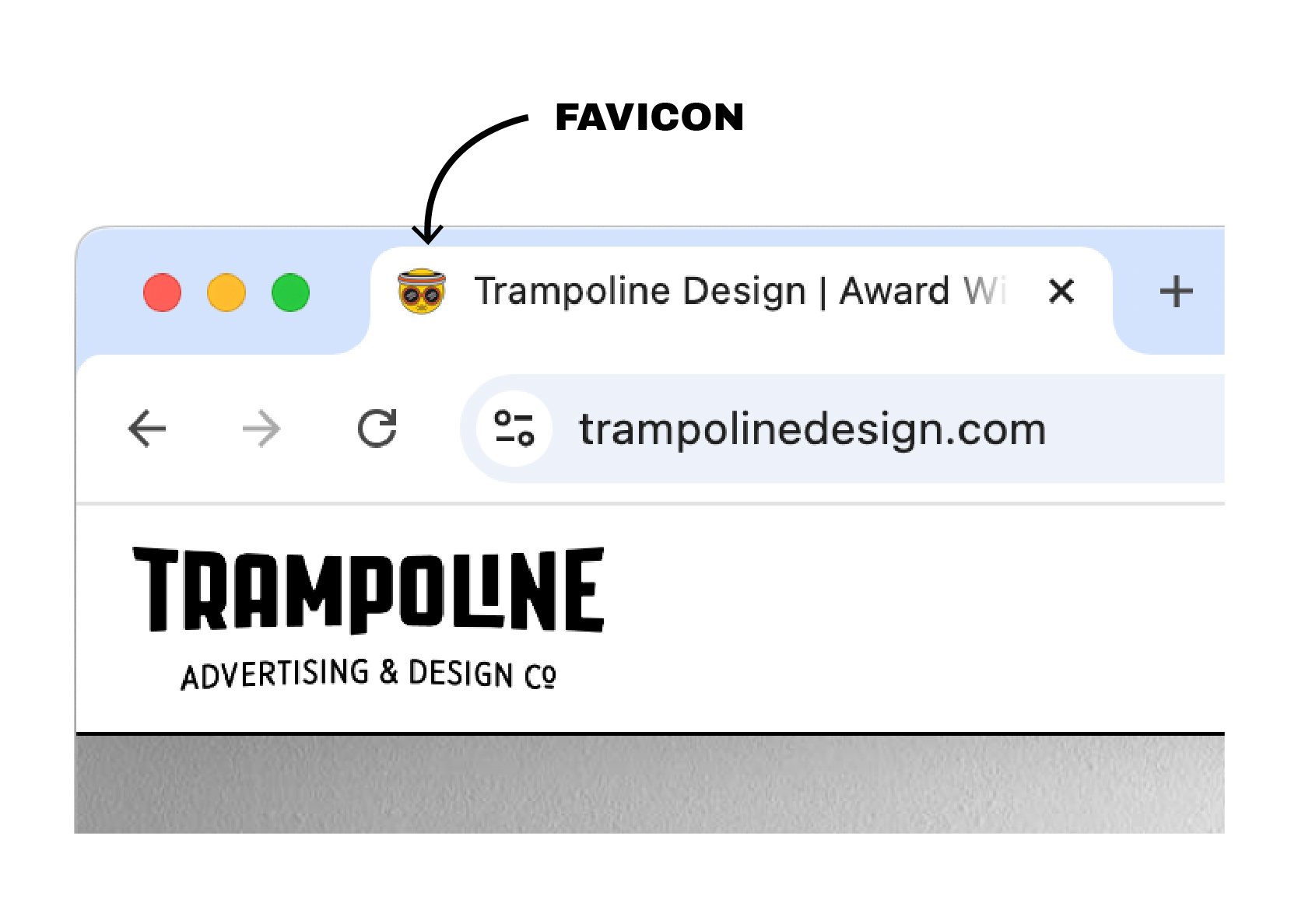
Does your website have a favicon?
The Favicon is the little icon in the URL tab of a website. It's small and often overlooked, but to us, it's the cherry on top. You know that whoever made the site took time to focus on the details to put their best foot forward.
Is your punctuation hanging?
Hanging your punctuation may sound weird, but it helps to make a piece feel buttoned up. When you hang punctuation, most commonly quotation marks or bullets, you allow them to float to the edge of the copy to create an uninterrupted margin for the following copy to flow down. This helps clean a piece up and helps with legibility.
Is there negative space?
Negative space is where there is no copy or images. It may seem a bit odd to want your ad to have "empty spaces," but these areas help to balance your piece. If you have too much going on in one design, your eye won't know where to look first and your message could be lost. Negative space allows the message to be clear, the design to be more inviting, and makes your design feel elevated.
What does your copy look like?
When we look at copy on any project, we look for so many things. How does the rag look? Are there any widows or orphans? How is the kerning? Is the line length too long? It may sound silly, but these are all things that help with the readability of a piece. If the line length is too long, it's hard to move to the next line. If the rag (the uneven margin on the site of a text block) is all over the place, it's harder to read. If there are widows or orphans (single or small words on their own line), the copy doesn't flow as well. If the kerning (the space between letters) is off, it can be distracting and hard to read. These are all little things that help pull your piece to the next level.
Are you consistent?
Consistent use of your brand across all your pieces helps to make your brand stronger and confident. It sends a clear message of who you are and what you do. On the flip side, if your brand lacks consistency, you start to create what feels like an alternate personality.
There is so much that goes into a good design, and when it’s done right, it comes together to create an experience that feels different. It is well-thought-out and clever.
This is what we love to do, it’s our creative bread and butter. We live to push the envelope and turn the screw, and when we’re all done, we get to step back and see what we’ve created.
 .sqs-block-summary-v2 {
.summary-title-link,
.summary-heading {
font-family: archivo black;
font-weight: 400;
font-size: 2rem !important;
color: ffffff;
} }


