Arrivals + Departures
What makes a place unforgettable?Is it an incredible experience, or an outlandish story? Is it time spent with family and friends? A meal you'll remember forever? Probably all of that, and then some. When we go about marketing a place as a destination—it needs to be worthy of a traveler's time and treasure. Our creative and account teams are looking to capture that special something about a place. Often, the elements that set a community apart are right in plain sight—architecture, geography, events, landmarks. Sometimes we have to dig for less obvious reasons to visit, but they exist—in a not-so-well-known hiking trail, secret swimmin' hole, or vintage vinyl record store just around the corner. Successfully marketed destinations have identities that are structured enough to offer consistency, but flexible enough to represent all that a place has to offer.
Artwork should capture the reason to visit, and set the tone (and expectations) for travelers. We select colors that represent the region, choose typefaces that are unique and legible, and write copy that works hard to put a reader in a specific place. These design decisions should solve specific communication challenges faced by the destination, and, its residents. No two places are the same, and the people who know a place the best are the ones who call it home. Our process leans heavily on the opinions of locals, with fact-finding focus groups that inform goals and direction, community design charettes to refine concepts and build consensus, and town hall presentations to reinforce a new approach.
Oneonta: We're onta something.™
Messaging needs to be clever enough to be noticed, but not so witty as to be off-putting. In the case of Oneonta, New York we used a re-worked word in their tagline to actually inform pronunciation of the city's name—a concern that came to light in our focus groups with community stakeholders. Design for public spaces can be a challenge, as the creative team needs to account for existing infrastructure, local signage ordinances, property holders, and naysayers. The results of that complicated process are often high-profile branding opportunities to welcome tourists, and reinforce outbound advertising efforts, letting outsiders know that they've arrived. With an established identity and some momentum, a placemaking campaign can grow in any direction—working with the options available in a given location. No opportunity to communicate an established message is too small, and any opportunity to use a great photo should be taken.
Vermont how you want.™
Consistent branding and use of design elements means that a place can be flexible with advertising. A solid identity allows for the creation of campaigns that showcase individual activities, and target specific groups of travelers, rather than trying to be everything to everyone. In the case of Southern Vermont, we chose to highlight some of the biggest reasons to visit, established—again—by a focus group at the start of the process. These different ads were served to disparate lists of antique lovers, hikers, paddlers, and foodies who would love Wilmington and West Dover, VT for very different reasons.
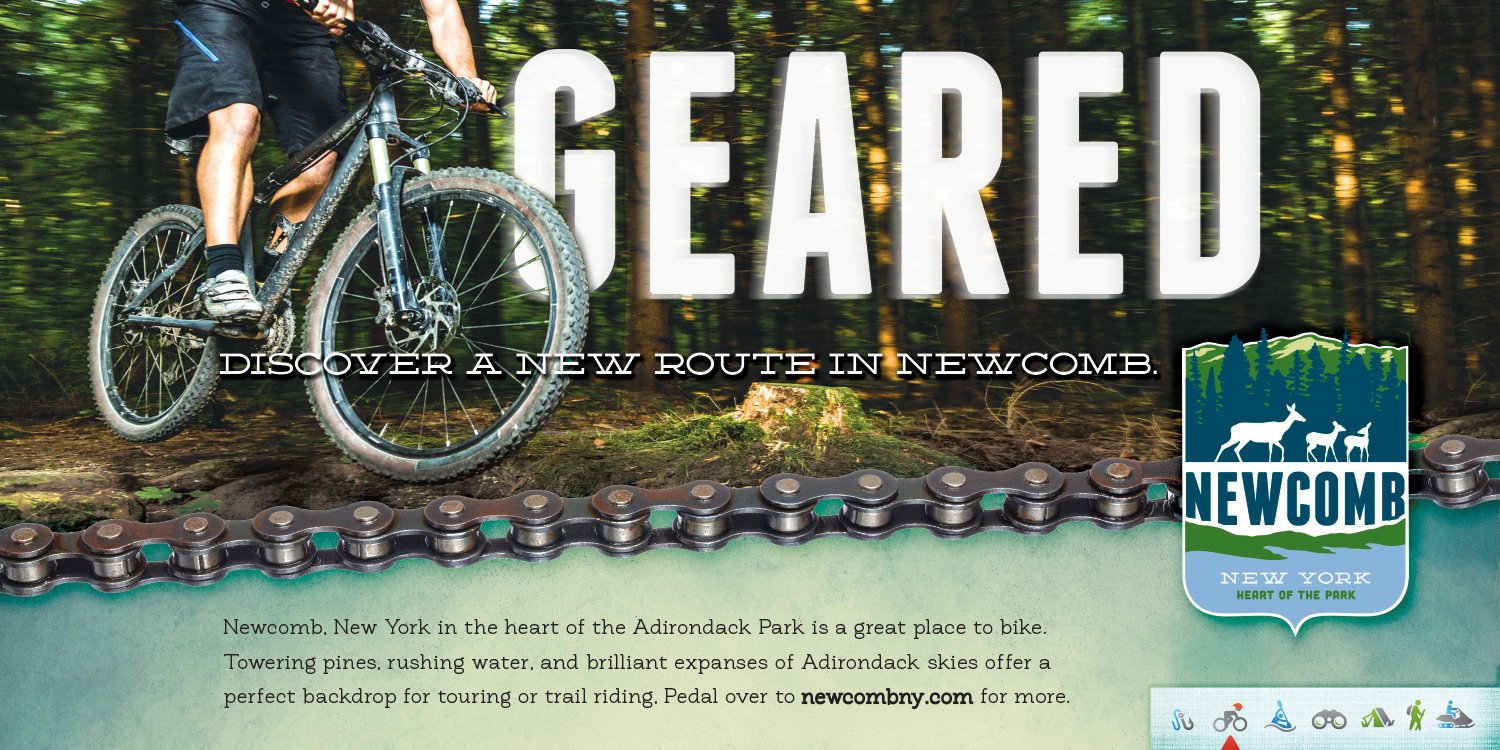
Gratuitous throwback to an award-winning campaign for the Town of Newcomb, in the Adirondacks of New York State. For more examples of Trampoline placemaking and our efforts to position destinations as a Guaranteed Good Time™ including results, check out: GoNorth, the Lake George Area, and St. Lawrence County.
 .sqs-block-summary-v2 {
.summary-title-link,
.summary-heading {
font-family: archivo black;
font-weight: 400;
font-size: 2rem !important;
color: ffffff;
} }


