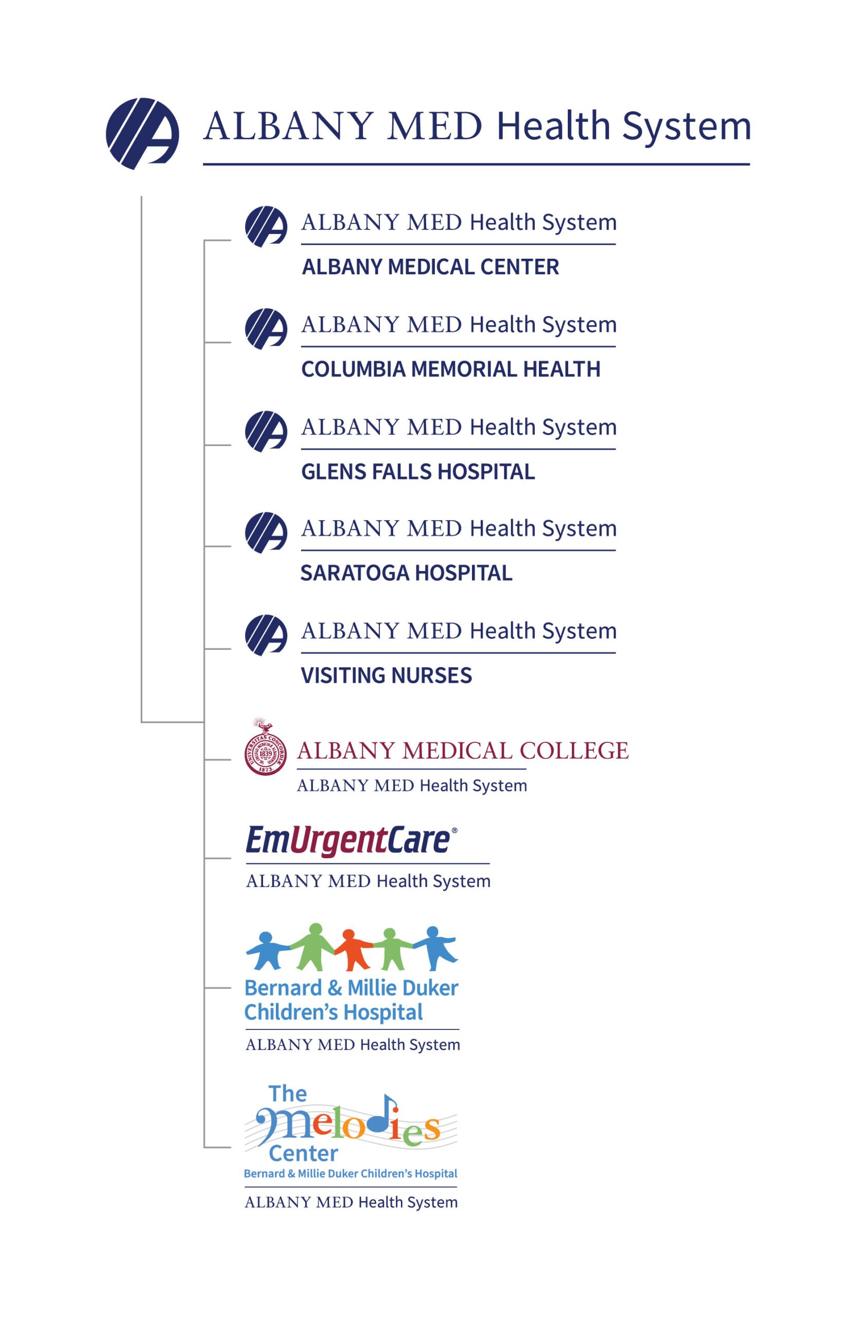
Albany Med Health System Brand-Aid
The Ask:
Create a System-Wide Style Guide for Albany Med Health System
Trampoline was invited to develop a style guide that would carry a parent logo across the entirety of their soon-to-launch Albany Med Health System. The System would include four local community hospitals, Glens Falls, Saratoga, Columbia Memorial and Malta, and their corresponding outpatient locations. Along with a Visiting Nurses Association.
The Task:
Big Picture structure, individual ownership
Albany Med Health System provided a draft logo and together we worked on incorporating the different hospitals and locations into a cohesive structure of brands and sub brands.
Each of the hospitals had unique design considerations, some related to donor recognition, others to satellite locations. It was also in the throes of COVID-19 that we embarked on this brand refinement process.
As patients and partners of Glens Falls Hospital, we had a personal attachment to the individual identity at a consumer level, which we extended to the other locations.
What We Learned:
Health Care delivers a consistent level of service, their design needs to be every bit as reliable
The transition from home town hospital to a health system with 4 campuses means big changes in strategy, design, and implementation. Individual styles give way to a system-wide approach designed to create repeat impressions and elevate awareness of the organization, and all the optional available to patients.
Confident leadership and solid design rationale can help to unify disparate opinions on marketing and design decisions. Our approach included a strategy document with brand pillars that helped to define both communication priorities and design choices.
Tightening up an existing system comes down to a lot of troubleshooting, and versioning. Alignment, line weights, icon size in relation to typography. The outcome is a system that allows for flexibility, but ultimately represents the greater brand first and foremost.
The process in the studio involved designers, art directors, brand-strategists, copywriters, proofreaders, and a lot of account management. Health System stakeholders included directors of marketing at four different hospitals, communication specialists, advisory boards, internal design teams, and third-party consultants—each making valuable contributions and addressing specifics.
The process to create and collaborate on this system took about 18 months, complicated by COVID-19, and the demands the pandemic put on health care professionals (including communications teams). The outcome is a living document that will help streamline outbound marketing efforts across all media—print and digital, outdoor and broadcast, signage, uniforms and more.
We can’t wait for you to see it. And, you’ll be seeing it a lot.
 .sqs-block-summary-v2 {
.summary-title-link,
.summary-heading {
font-family: archivo black;
font-weight: 400;
font-size: 2rem !important;
color: ffffff;
} }


